

What is “responsive”?
Unless you’re a practicing hermit, you’ve undoubtedly heard the phrases “responsive web site” or “responsive design”. But what exactly does “responsive” mean in the context of a web site?
To the uninitiated, it might mean the obvious – a web site that, well, “responds” quickly. Of course, we all expect web sites to have good performance, and therefore “respond” well – especially when we’re charged with actually building one. But that’s not what “responsive” means here. A responsive web site is one whose layout’s look and feel, and even navigation elements, change dynamically as the web page “responds” to the viewport of the device displaying the web page.
Responsive design, therefore, is the practice of designing and architecting a web site in such a way that it behaves and adjusts responsively.
Viewport
Viewport – come again? Viewport is nothing more than a formal term that describes the user’s actual visible area of a web page. Every device capable of displaying a web page has a viewport. The web browser on your computer desktop has a viewport, determined by the relative dimensions of the browser’s window. The web browser on your tablet or phone has a viewport, typically determined by that device’s physical display. Oh, and of course, as you rotate a device, say from portrait to landscape, the viewport changes accordingly because the relative dimensions of the display change with rotation.
Advances in the key components of web page technology enable web designers and developers to build web sites that are aware of the current device’s viewport, and make dynamic adjustments. These technology components include HTML5, CSS3, and Javascript ES5 (a.k.a. ECMAScript 5). All modern web browsers support these technologies and viewport awareness.
For an example of responsive design and viewport awareness, view this site’s home page (www.proteloinc.com) in the Google Chrome web browser. With the home page displayed, press the key on your keyboard to open Chrome’s Developer Tools window. This will likely open in a panel at the bottom of the browser window. For best results here, detach this panel to a separate window. See Figure 1 for details.
Then, in the Developer Tools window, toggle the Device Toolbar. See Figure 2 for details.
This cool tool allows you to easily simulate how a web site will look on different devices (portrait and landscape). Figure 3 shows an example simulating an Apple iPhone 6 Plus in portrait mode. Try it for yourself and see how our home page behaves with different devices (and therefore, viewports). Now that’s responsive!
Figure 1: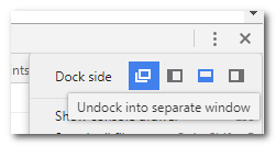
Figure 2: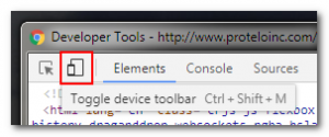
Figure 3:
History Of Web For Mobile
In the (good?) ol’ days, web sites were built with largely static content, designed to be displayed in a web browser running on a largeish desktop or laptop computer. Nobody really gave a thought about different size displays. They were mostly standard sizes, wider than they were tall.
With the advent of “smart” phones that were capable of displaying web sites, designers quickly realized that their web sites weren’t all that usable on smaller devices. Their web pages were either too large for the device, requiring a lot of continuous scrolling, or they were “scrunched” to fit in the small real estate available, making them impossible to read. And yes, there are still a lot of such web sites in existence – we won’t go there!
Internet retailers in particular, realized that they had a new audience for their product offerings – mobile users. If such a user could be persuaded to search for and buy product while on the move instead of waiting until they got back home to their desktop computer, that surely would increase the likelihood of a sale. But, if you can’t actually navigate the web site on a small mobile device . . .
Enter the “m.” subdomain! Remember those? Web site domains that began with “m.” instead of “www.”? Designers started building 2 versions of their web sites. A “normal” one for display in larger desktop browsers and a second “scaled down” one just for those mobile users. That worked for a while until new problems began to emerge.
These “scaled down” versions with the “m.” subdomain were typically optimized for smallish devices, operating in portrait mode only (most people with smart phones typically prefer to hold them in portrait mode rather than landscape mode). Then as newer, larger mobile devices began to appear, like the Apple iPad and Android tablets, these scaled down versions looked clunky and downright ugly. This is why the browsers on mobile devices typically give you a menu option “Request desktop site”. This allows you to switch between the scaled down mobile version and the desktop-sized version. Better, but still not great.
A second problem (for the web site designer & developer), was that now two separate and distinct web sites needed to be developed and maintained which added to the cost and complexity of having a web presence.
The breakthrough came with the advanced web technologies afforded by HTML5, CSS3, and Javascript ES5 (see earlier for details). Now with modern devices/browsers and these technologies, web developers and designers can build a single web site that dynamically adjusts itself to the device it’s being displayed on, portrait or landscape, not just in terms of scale and layout, but also in terms of the user’s experience with the web site. More in that in the next section.

UX vs UI
“I (think) I know what UI means, but what in the world is UX?”
Put simply, UI stands for User Interface while UX stands for User Experience. OK, so what?
Your web site’s UI generally refers to its look and feel; for example, how elements are laid out on the web page, the use of colors and imagery, your company’s branding – essentially the “visual” aspects of your site.
Your web site’s UX generally refers to its usability; for example, how users navigate, how they are led to a purchase, how your web site retains visitors, rather than repels them. Yes, there are many web sites out there that provide such a lousy experience that they actually repel me, and discourage me from ever visiting again (no matter how pretty they might look).
To put it another way, a visitor to your web site comes with a problem that they hope your web site might help them solve. It might be to search for information. It might be to find a product. It might be to ask a question or to leave feedback. If your web site actively helps the visitor to solve their problem, you have a functional UX. If your web site gets in the way of solving their problem, you have a dysfunctional UX.
I recently saw a quote comparing UI vs UX. I can’t remember who to attribute it to, but it essentially read:
“If you have a beautiful looking web site, but it’s a pain in the behind to use, you have good UI but bad UX. If you have an easy to use web site, but it looks like crap, you have good UX but bad UI.” The goal, of course, is to design and develop a web site with good UI and UX.
So how does this relate to responsive web sites? Well, your UI and UX will need to adjust for the different environments that, say, a desktop user and a smart phone user will be operating in.
The desktop user will be working with a lot of screen real estate, likely in landscape mode. They’ll be able to visualize and absorb multiple visual elements of a web page simultaneously without a lot of scrolling. They’ll easily be able to navigate and click on your various design elements, getting them to where they need to be, quickly and efficiently.
The smart phone user, on the other hand, will be working with restricted real estate, likely in portrait mode. They’ll only be able to visualize and absorb a limited number of visual elements. Scrolling becomes a chore (and a bore). Perhaps you need to limit the visual elements you initially show to just the essential ones, allowing additional elements to be displayed with a quick finger tap or swipe? Perhaps you leave out some elements altogether to arrive at a simpler representation for a time-constrained visitor “on the go”?
Pay attention to both the UI and UX aspects of your web site’s responsive design. It will pay dividends.
Finally…
We hope you found this post informative and useful.
Be on the lookout for a follow-up post discussing the new paradigm in web site design & construction – Single Page Applications (or SPA). Happy website building!

Empowering Entrepreneurs
To Build Legendary Businesses
The importance of managing the
shopping experience with a
cloud-based Commerce platform.
